
Getting your artwork print-ready for cups
A cup is small, but it carries your whole brand, so the artwork on it has to be right. The good news: getting a design print-ready is mostly a short checklist — and if anything is unclear, we check your files free of charge. This guide covers what print-ready artwork for custom paper cups actually means, and how to hand over files so the result looks exactly as you intended.
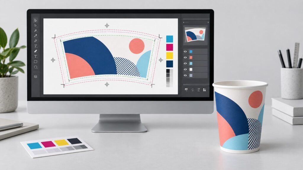
The single most important thing you can do is supply your logo and key graphics as vector art. Vector files describe shapes with maths rather than pixels, so they stay razor-sharp whether they are printed on a 100 ml (4 oz) espresso cup or a 450 ml (16 oz) to-go cup. Preferred formats are PDF, AI or EPS. High-resolution PNG or JPG can sometimes work for photographic elements, but they are assessed case by case — and a logo supplied only as a small PNG is the most common reason a design cannot be reproduced cleanly. If in doubt, send what you have — our designers will assess whether it works.
Fonts are the second most common snag. If your file references a font that is not embedded, another computer may substitute a different one and quietly change your wordmark. The fix is to convert text to outlines (in Adobe Illustrator: select the type, then Type → Create Outlines). This turns letters into fixed shapes that print exactly as drawn, on any system. Keep an editable copy for yourself in case you need to change the wording later, and send the outlined version for print.
Screens show colour in RGB, but cups are printed in CMYK or with Pantone spot inks. A bright RGB blue or a neon green can look duller or shift once converted, so it is best to define your colours in CMYK from the start, or to specify Pantone references for brand-critical colours. For logo-led designs, one or two Pantone spot colours are often the most economical and the most consistent choice. Nordicup prints with food-contact-safe inks, and our designers will flag any colour that is likely to shift so there are no surprises on the proof.
Work to the dieline: bleed and safe zones
A cup is not a rectangle. Flattened out, the printable area is a curved fan that tapers from the wider rim to the narrower base and wraps around a seam. That is why each cup size has its own dieline template, supplied once you confirm the construction and size. Place your artwork on that template and two rules keep it safe:
extend any background colour or image slightly beyond the trim edge so that small movements on press never leave a white sliver at the rim or base.
keep logos, text and anything you cannot afford to lose comfortably inside the marked safe area, away from the trimmed edges.
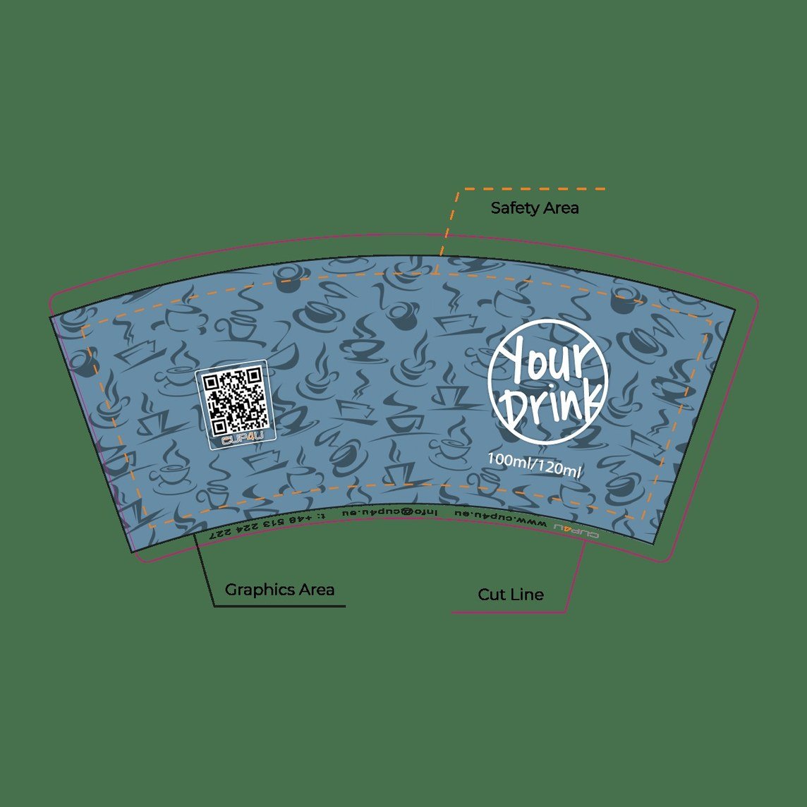
Mind the seam, the rim and the base
Cups are formed from a wrap that overlaps at a vertical seam, so avoid placing a crucial detail — like a single line of small text or half your logo — right where the seam falls. The area closest to the rim and base is also kept clear of critical artwork: those zones are needed for food-safe handling and for the machinery that forms and stacks the cup. The dieline shows all of this; following it is what separates a clean result from one that is almost right.
If your design uses photographs or raster textures, supply them at roughly 300 dpi at final print size. Enlarging a small web image to fill a cup will look soft or blocky no matter how good the press is, because the detail simply is not in the file. Start from the highest-resolution original you have.
You do not have to get every one of these points perfect on your own. Send your files and we will check them against the technical specifications — vector integrity, outlined text, colour mode, bleed, safe zones and resolution — and tell you plainly what, if anything, needs adjusting. And if you do not have print-ready files at all, that is fine: send us your logo and brand colours and we will prepare the design and the print files free of charge.
From files to press: the three-step proof
Once your artwork is in, approval follows the same clear path every time:
Your files are checked against the specification for the chosen cup and size.
You receive a proof showing your design placed on the cup, with placement and colour notes so you can see exactly how it will sit.
Nothing goes to production until you sign it off in writing. That approval is what starts the 2–3 week production clock.
Quick print-ready checklist
Before you send, run through this: artwork is vector (PDF, AI or EPS); all text is outlined; colours are set in CMYK or specified as Pantone; the design sits on the correct dieline for your cup size; backgrounds extend into the bleed; logos and text stay inside the safe zone; any photos are 300 dpi at final size; and nothing critical lands on the seam, rim or base. Tick those and your proof will almost always come back first time.
Want us to check your files for you?
Send us your artwork — or just your logo and brand colours — and we will check that it is print-ready, free of charge. We reply within one business day.
FAQ
A vector PDF, AI or EPS is ideal, especially for logos and text. High-resolution PNG or JPG can work for photographic elements and is reviewed case by case. When possible, send vector so your design stays sharp at every cup size.
Possibly — if the resolution is high enough; our designers will assess it. If it is not suitable, we will tell you what is needed, or help recreate it as vector so it reproduces cleanly. Send your logo and brand colours and you will get a clear answer.
Yes. We prepare print-ready artwork from your logo and brand colours free of charge — send what you have, and you will receive a proof to approve before production.
Screens are RGB and print is CMYK or Pantone, so some shift is normal. Defining colours in CMYK or specifying Pantone references gives the closest, most consistent match, and any colour likely to shift is flagged before you approve the proof.
Each cup size has its own dieline, provided once you confirm the construction and size. Place your artwork on that template so bleed and safe zones are correct from the start.
Other articles
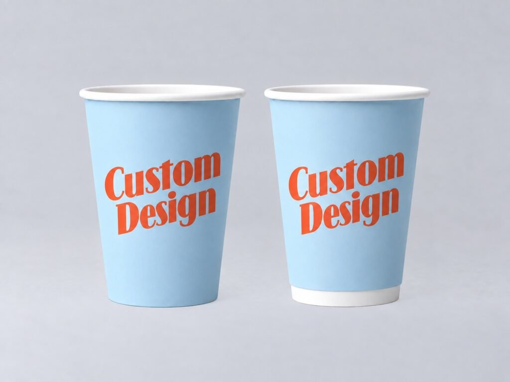
Single-wall or double-wall — which cup fits?
When the insulating air gap is worth it, in plain language — and when a single-wall cup is the smarter, cheaper choice.
Read →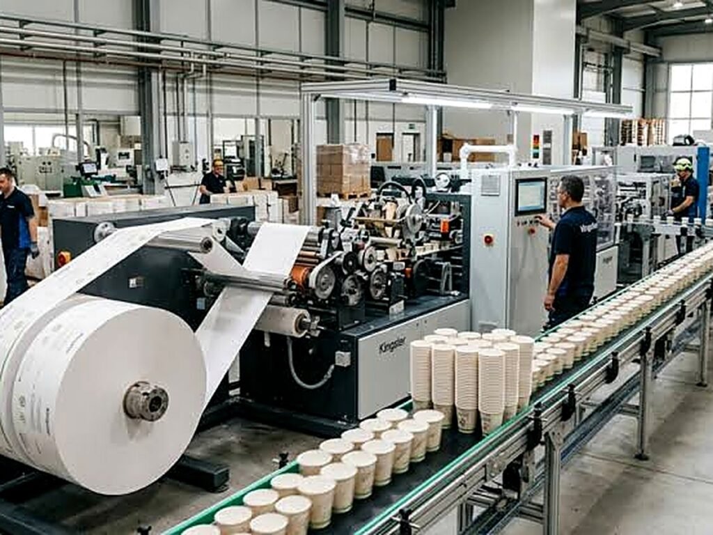
Why custom cup lead times are 2–3 weeks
Where the 2–3 weeks go, stage by stage, when the clock starts, what can stretch the lead time, and how to plan a launch or a repeat order around it.
Read →
Offset vs flexographic printing on cups: what’s the difference?
What changes between CMYK offset and flexo — detail, colour and cost — and how the right method follows your design and order quantity.
Read →